Wednesday, 13 September 2017

Some amazing graphic novels


In the last year some really amazing graphic novels have been published. I just wanted to share them with you, they're just so fantastic.

Black Dog: the Dreams of Paul Nash, by David McKean
http://www.darkhorse.com/Books/30-577/Black-Dog-The-Dreams-of-Paul-Nash-TPB#prettyPhoto


Irmina by Barbara Yelin
http://www.comicsbeat.com/review-barbara-yelins-irmina-shows-how-history-destroys-us-in-little-ways/


Night Lights by Lorena Alvarez
http://nobrow.net/shop/nightlights/?


The Celestial Bibendum by Nicolas de Crécy
http://www.humanoids.com/album/266


Converses

I'm rediscovering a love for Converse trainers (there's a pair I'm drooling over at the moment with waves and sun rays on the ankle). It's a company I'd love to work with as an illustrator. 
This drawing started about 8 years ago as an exercise to keep my skills sharp. Afterwards it became a watercolour (which looks a bit weak now), and now finally it's a digital drawing. 
I wanted to give the impression it was the shoe version of a bag of sweets; the colours were most important, and I learned so much about different shifts of hue in the shadows. Also the marks had to stay fresh and lively, so I had to pull back from getting intense about detail and neatness. Sometimes if the habit of being neat is calling I have to hold the pen like a brush and have the screen upright like an easel. Weirdly, this makes my mind shift from hard concentration to a more relaxed and painterly way of thinking. 
Looking at the piece I can't help seeing that it's a bit too detailed at average size, it would work better scaled up to over a metre wide. But for medium sized drawings, roughness is something to experiment with, how far can it go before falling apart as a recognisable object?


Thursday, 17 August 2017

York Minster King Screen

The latest drawing is the Kings Screen in York Minster. It's a very ornately carved stone screen in the centre of the cathedral, showing all the Kings of England from William the Conqueror to Henry VII.
A lot of the figures have amazing beautifully carved curly hair and beards, which made me inspired to  draw them.


This is the 2nd phase, after drawing I laid down a rough sand colour background, and then add the shadows and highlights. The only colour on the carving is a red back to the alcoves and gold on the crowns and high decorations. 


Sculptural subjects have always fascinated me, and describing the shapes and how the lighting fell on them was really enjoyable. 


The spooky night-time version (which is inevitable with my drawings). A dark blue overlay and some masking for where the light falls.

Tuesday, 4 July 2017

More portrait practice

Roughly once a month I draw a portrait. It's really enjoyable and the best way to sharpen my drawing, and also practice with colour. Also I love it, it's really difficult.

The original photo struck me as the coolest shot of Peter Capaldi (I've been a fan since my 20's), and was struck by how interesting his hands are. They are so German expressionist! The angles of the wrists are quite Egon Schiele. 😀
Once it was drawn I couldn't decide whether to leave it as a drawing or go for colour. The colour is really subtle and complex in the reference photo, and so decided to jump in and tackle it.
The picture actually hangs on the hands, the tension of the hand to wrist, and the fingers locked together really jumps out at you.

Also, I'm starting to develop a 'chunky food' theme- simplified items created almost in facets, with rough areas of colour for interest. How far this idea will go, who knows, but it's good fun.


Wednesday, 10 May 2017

Mortal Engines - The Gut- final stage

'The Gut' painting from Mortal Engines is finally finished. It took quite some time to get the colour and lighting right, and to keep it in balance. Adding the blue light at the top of the eaten city was a way of balancing the composition with colour, as it's surrounded by orange/yellow colour, and the uplighting is red, so made a lovely hellish contrast.
I drew from a lot of research material- mostly steel mills for the smoke and atmosphere, and Hugh Ferriss drawings to see how light and dark could be used in the composition.

You can see an animation showing the picture being developed here:


Friday, 21 April 2017

Mortal Engines -The Gut

The next big artwork is The Gut, from Mortal Engines (the previous entry covered London the traction city chasing Salthook).

As usual it starts with very simple composition sketches. I find this part the hardest, it's something that has to be really worked on. There were two angles I was interested in, looking down from a walkway onto the industrial scene, and looking from the floor across and upwards. The latter has more impact, I really wanted to show how hellish, dirty and crazy it is in The Gut. This part of London is at the base of the city, and so has 6 storeys of suburbs weighing down on it, so it needs the heaviness of the ceiling bearing down on the viewer.


The drawings look very rough, but the way I think and draw at this stage is rough so I don't get attached to any particular version. It's more likely I'm wrestling the ideas from abstract fluff to a solid concept. Drawings 1 and 2 are looking down from a walkway, using a strong zigzag and criss-crossing. 3 and 4 are showing the scene from floor level, trying to find the strongest angles to use. 5 was too weak, and 6 is looking down at a skewed angle to make it look unsettling. 7 and 8 are back to the floor level, finding the strongest shapes to lead the eye in. 8 was the one I settled on, it had the weight bearing down as the girders and the giant heap of wrecked town in the centre. Halfway through the sketching I realised that you can't have The Gut without it doing it's job, which is disassembling towns and stripping their assets. So you have a central focus, and the girders acting like a frame around it. Some of the references I took are Piranesi's prison prints, Hugh Ferriss' city scenes, and a lot of abandoned factories and refineries. Also, we had an exhibition in the city gallery of WW1 art, views of munitions factories which were really dramatic and huge, like set design backdrops.


Drawing stage 1- using a grid to stop me from going off angle, starting to rough out girders and a town. The town is actually a part which has been sawn off by the rotary saws at the front outside of London. That's why it looks a little like a cross-section.


Stage 2- The town was too small, it didn't look like a big deal to cut it up, so increased it to scrape the top girders. The image looked like it needed a foreground element to make it more 3d, so I added a girder being ripped and lifted from the town.


Stage 3- the final drawing, everything is clear, and I know where to paint. The drawing is actually going above the painting layers, either as overlay, or multiply. It's hard to tell from the picture but I used a Wet Pencil brush to get the rough organic line.

That's the lot for now, I'm hoping this weekend lots of colour will be added. It's set up on layers so the background can be faded/blurred, and likewise with the foreground. There may even be some bits added in After Effects, like dust and smoke movement, or even a camera move as you get closer to the central view.

Thursday, 6 April 2017

Mortal Engines

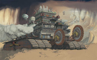
The latest personal project is a scene of London the traction city from Philip Reeve's book Mortal Engines
This is such an enjoyable series that I was inspired to make my own vision of the city. There have been several different pictures by other artists, but I wanted to make a comprehensive version where you could really see each tier's architecture. 

I concentrated on the overall feeling of the scene, how I felt about this giant beast of a city rumbling across the land, and the terror felt by the smaller cities it consumed. 

Pinterest was a real help for research, and I could keep them online instead of downloading loads of images. Reference included old pics of London docks, the Barbican, enormous rock cutting saws, and oil rigs.

In addition I was keen to not fall into the trap of concept work having too much detail in the distance, so gave a veil of Turner-esque raincloud as a backdrop. 


Stage 1- roughing out after the line drawing 


 Stage 2- adding grungy colours, especially the rust and decay on the metalwork and concrete. 


 Stage 3- the caterpillar tracks didn't look beefy enough to carry the city across mud and rock, so I added an extra row each side. Before it looked like it was on tip-toes. 


 Stage 4- working on the sky and smoke, and adding little airships. 


The buildings took a lot of work, including deciding how much tiny detail to have.


 Stage 5- Adding the town 'Salthook' as London's prey, and finishing the hi lights, backdrop and shadows. 

The line layer- (for drawing fans). 


Back into the blogging and more Jonathan Strange and Mr Norrell.

Hi,
well I've been away for too long, making amazing books for Carlton Books Ltd has taken up a lot of my energy, and now it's time to get some new posts written.

Last year I started a series of large drawings about Jonathan Strange and Mr Norrell BBC TV drama. The portraits are in the previous post, but last year I decided to make a set of book pages.

It was created as a challenge to make consistently good drawings for a project, and as the work progressed it became more and more enjoyable. It was very satisfying to be totally creative and push myself, to really improve my drawing and colour skills.

Spread 1- The Characters


Below is the background drawing. This is taken from a drawing which became an etching a couple of years ago. I wanted something suitably spooky and rich, with lots of branches which I could 'hang' the characters' pictures from. In the series there are mirrors which are portals to the Raven King's world, some of it is in a forest. I also wanted to make the artwork rich and detailed, to match that luxurious quality of the Regency era.


Spread 2- The King's Roads


This is the beautiful and decrepit kingdom of the Raven King, which Jonathan explores via mirrors. I wanted to mix the text with the imagery, without it intruding on the main scene- which was the amazing piled up view of towers. The original was created by Milk-vfx, and was absolutely stunning. I was really impressed with how they'd turned a corner of Fountains Abbey into a different world.

When I was an art student at Harrogate College we used to go drawing in the Abbey, getting very cold and sore knees bending down to draw on huge pieces of paper on the ground, and covered in pastel dust. I suppose this is why I have a soft spot for the place.


Spread 3- Strange and Norrell summon the Raven King


This is the climax of the series, when the two magicians summon the very powerful Raven King to help Strange rescue his wife from the evil 'Gentleman'. Again, I had to judge which part of the scene to use, (and then go down a different route), and finally return to the most powerful image of the storm of ravens entering the library. 

Layout drawing.

Final main drawing.


The Cover
I love book covers, and realised if it was to be a complete project, it needed a cover. All the design is illustrated, no photography, and a lot of time was spent in deciding on the layout, mostly where the 2 ravens sat on the front. Would it be a subtle cover where the design hints at the content, or make it rich and detailed? The latter won- it has to spring out from a bookshelf to catch the eye, and I'm a big fan of dramatic imagery. The BBC and Bloomsbury logos are included as they deserved mention, being the publisher and producer of the book and TV drama.